Wordpress has been my blogging engine of choice for a long time. It’s always been comfortable to use, custom template styling is straightforward and well documented, and the administrative interface gets better with every release. The open-source license and an extensive library of third-party themes, widgets and extensions can’t hurt either.
Yet there’s always room for change, even if only for its own sake. The beautiful admin interface and excellent iOS apps of Squarespace have intrigued me lately. Unlimited bandwidth in the high-price tier is helpful, since it’s always nice to have something to show if a person (and 100,000 of his friends) decides to drop by your virtual doorstep.
I’ll also admit the challenge of tearing apart our digital LEGO fortress and rebuilding it with completely different pieces is tough to resist.
With that gauntlet cast down, we decided to reimplement our site on the Squarespace platform. It cost me about a month of work (with very few blog posts in the interim) but we’re quite happy with the results.
In this longish post, I’ll cover the basics of how we used Typekit and the Takitapart CSS Framework to reimplement our theme in an updated and responsive manner.
Sign-up and Content Import
Starting March 30, Squarespace greatly simplified its pricing and plans.
You now have two options:
- Standard: $8/mo (billed annually) for 2GB of storage, 20 pages and 500 GB of bandwidth, plus custom domain support
- Unlimited: $16/mo (billed annually) for unlimited storage, pages and bandwidth, plus some other advanced options
Armed with the 10% discount code turnsout from 5by5’s latest episode of Back to Work, I signed up for the Unlimited plan.
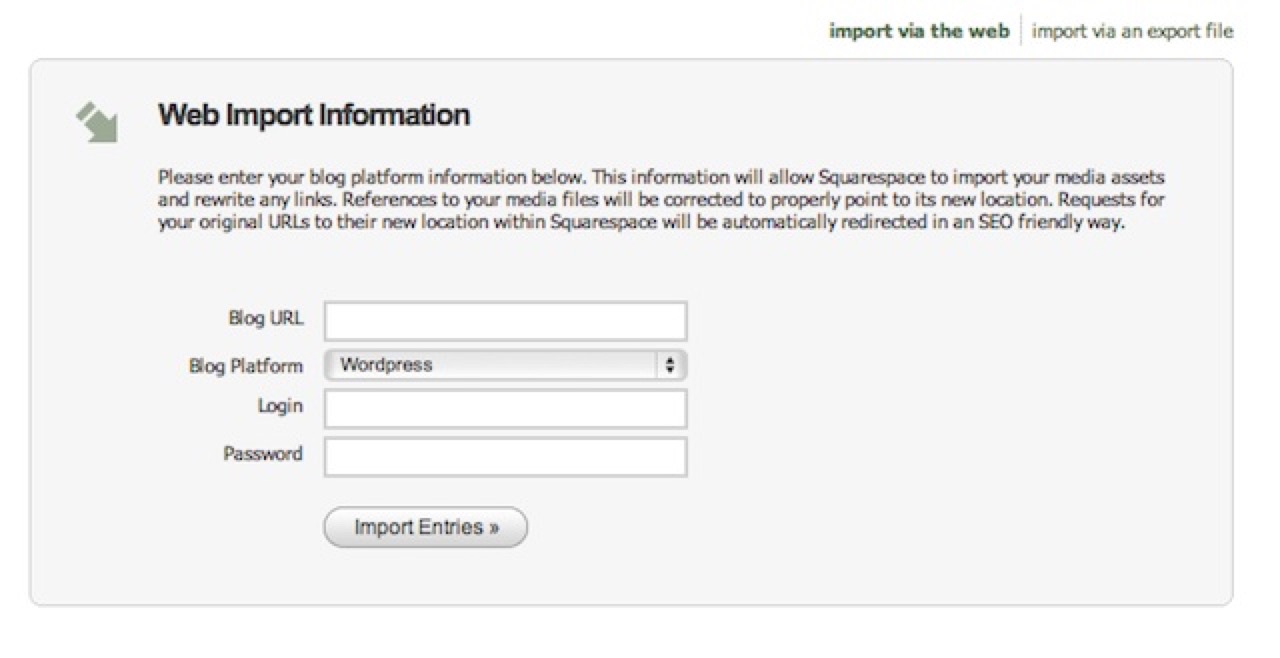
Blog Importer
Content import is straightforward using their Blog Importer tool, although some Wordpress formatting quirks (like randomly inserting extra <p></p> elements between otherwise normal paragraphs) required some editing. You’ll probably find a few older posts still lurking in our site’s back catalog that still need some cleanup. Let me know and I’ll fix them.
Template Decisions
Squarespace comes with several excellent built-in templates, but offers an unusually high degree of customization using its admin interface.
When our site moved from Tumblr to Wordpress last fall I purchased and tweaked Khoi Vinh and Allan Cole’s excellent Basic Maths template, and we wanted to keep our existing look as much as possible.
Still, our design as it stood needed some work. While the original had a nice iPhone layout, my tweaks to Khoi’s template broke the interface (badly) when viewing a page in an app’s WebView rather than Safari. Since many people come to our links via RSS readers and Twitter clients, this wasn’t going to be sustainable.
Also, we felt this was a great opportunity to try out responsive grid-based design. Bob was just finishing up development on his new hybrid CSS framework and this seemed like the perfect place to try it out.
Aiming at a fluid, responsive layout for all screen sizes, we started designing.
Custom Typography with Typekit
If you haven’t considered Typekit for web typography yet, I highly recommend it. The service was recently purchased by Adobe, and despite my initial skepticism it’s getting better all the time.
We were using two Typekit fonts on the old site, Futura (sans-serif headers) and Goudy (serif body text). Unfortunately, we ran into a problem with Goudy, since the typeface doesn’t include bold or italicized variants. Our body text is now Adobe Caslon, and so far it’s working out great.
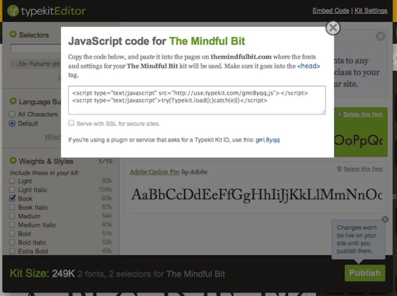
Typekit Editor
The Typekit editor interface walks you through adding the necessary header code to your site. For Squarespace users, you’ll have to add the necessary code in the Admin interface. Choose “Extra Header Code” in:
Structure > Website Settings > Code Injection
Since Bob always says a picture is worth a thousand words, here’s how it looks on our site, with the Typekit code highlighted:
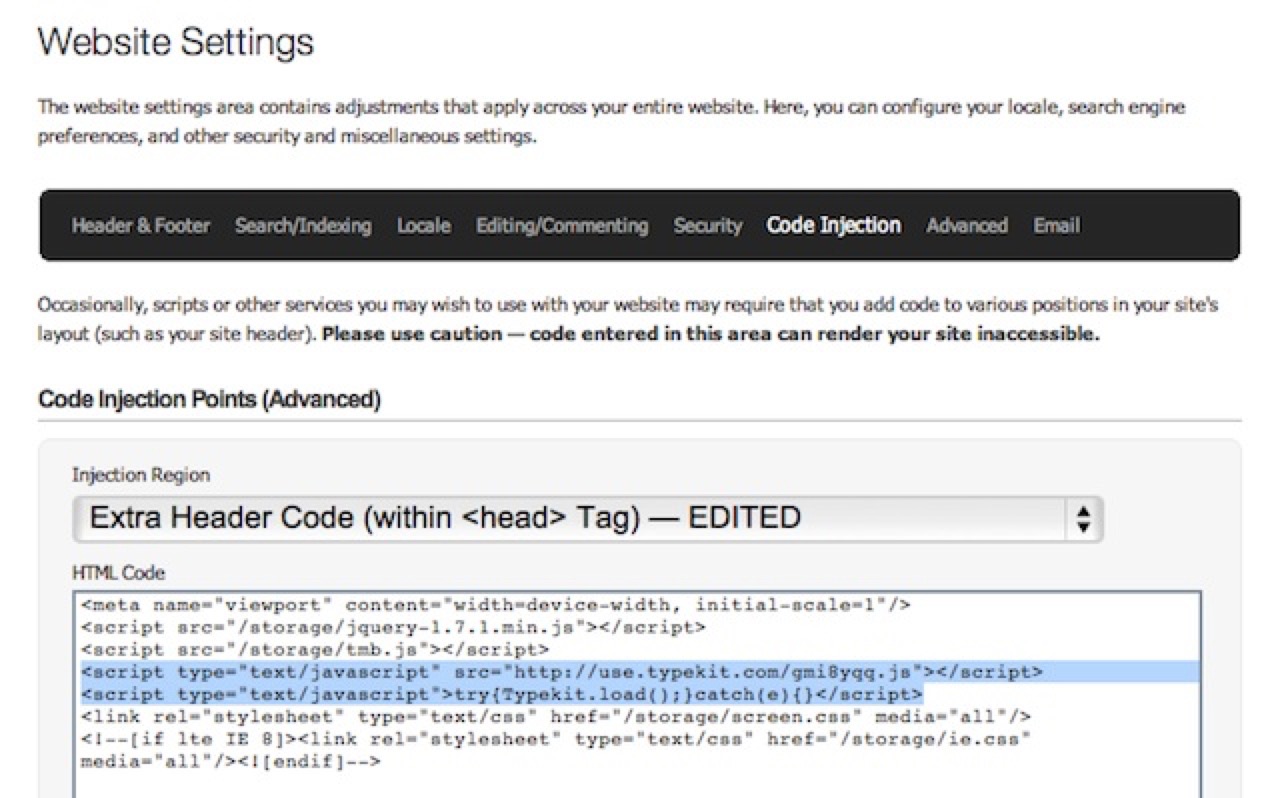
Typekit Headers
Responsive Site Design Using the Takitapart CSS Framework
The current version of Squarespace (5) offers no mobile-optimized themes. While this may change in the near future, for now the mindset seems to be that most mobile devices do a good enough job with standard-layout websites that it’s not worth the trouble to go responsive.
We’ve been trying to go the other route at high90, designing for “mobile-first” whenever possible. This is likely to be the next holy-war in web design and we’re too pragmatic to feel strongly either way. We figured it was worth giving responsive design a shot with The Mindful Bit and seeing if we could make it work on a non-optimized platform like Squarespace.
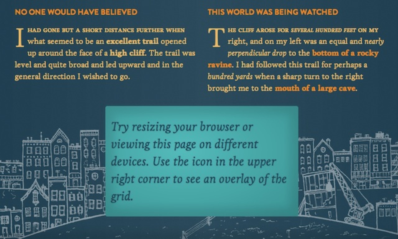
Takitapart CSS Framework
Bob has been designing the Takitapart CSS Framework for some time, mashing it up from a number of other grid-based frameworks and integrating Compass and Sass to give us something quick, responsive and flexible for our clients’ websites.
I have to say, after using Compass and Sass I’m not sure I can ever happily return to bare CSS again. The detailed use of these two Ruby-based style aids are beyond this (already lengthy) article’s scope, but I encourage you to visit the links above and check them out. I will only say that variables and nested selectors have made styling web pages a whole lot easier, and in the end it all compiles down to standards-compliant CSS.
The biggest challenge in using Compass and Sass with Squarespace is that you’ll need to upload and link to a separate CSS file. Squarespace has a very robust internal CSS editor, but a project like this would have required repeatedly cutting and pasting generated CSS into a web-based text editor. This was beyond my patience (believe me, I tried).
Luckily, you can upload files to local storage, and the process is quick and easy enough that repeatedly uploading new .css and .js files wasn’t a real bother.
You link to your new stylesheet the same way you added the Typekit code to the header. In my case, I just added:
<link rel="stylesheet" type="text/css" href="/storage/screen.css" media="all"/>
If you need an additional stylesheet to support older versions of Internet Explorer, you can use conditional comments to link to an additional stylesheet for tweaks:
<!--[if lte IE 8]><link rel="stylesheet" type="text/css" href="/storage/ie.css" media="all"/><![endif]-->
In our case, older versions of IE degrade to the mobile site. If I get the time, I’ll try to make things more robust, but for now everything should work great for IE9 and up.
Them’s the breaks
A major decision for any responsive design is where (in terms of screen width) to break the layout for different screen sizes.
The Takitapart CSS Framework is em-based, and this site’s implementation uses a ratio of 1em to 16px with a 12 column grid. This gives the following transition points:
Screens less than 480 pixels (30 em) wide
This view works for most mobile phones

400 Pixels
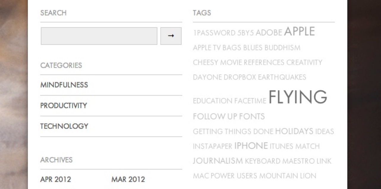
Screens from 480 to 592 pixels (30 to 37 em) wide
This view allows for a second column of widgets at the bottom of the screen
540 Pixels
Screens from 592 to 736 pixels (37 to 46 em) wide
This view works for most 16 x 9 tablets (like the Nook and Kindle Fire) in portrait mode

600 Pixels
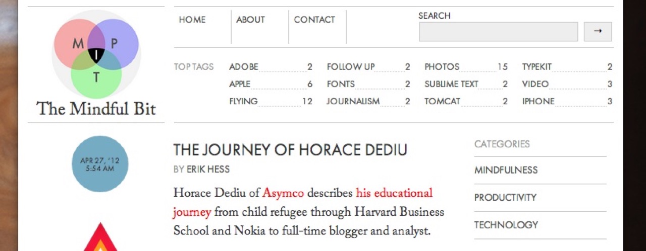
Screens from 736 to 960 pixels (46 to 60 em) wide
This view works for iPads in portrait mode
768 Pixels
Screens from 960 to 1200 pixels (60 to 75 em) wide
This view works for most tablets in landscape mode and gives the final column layout

1024 Pixels
Screens from 1200 to 1600 pixels (75 to 100 em) wide
This view adds one column of margin to each side to keep the content from getting too wide

1280 Pixels
Screens greater than 1600 pixels (100 em) wide
This view adds a second column of margin to each side to keep the content from getting too wide

1920 Pixels
Things left to do
The site is still a little heavy, taking from one to two seconds to load on a good broadband connection. While most of the site’s size comes from our Typekit fonts (237KB), they’re some of the fastest resources to load (41ms).
There’s plenty of optimization left to do, so load times should improve as I do further updates.
Eventually, I’d also like to give the full 1024px layout to users of earlier IE versions. This will just take a little bit of time and effort. Hopefully I can get these poor souls a glass of ice water soon.
If you have any suggestions, questions or comments, I’d love to hear them. Use the form below or get in touch with me via Twitter at @themindfulbit.