Air France Flight 447
The Telegraph had an excellent article over the weekend on the Air France Flight 447 mishap that was unusually well written for a mass-media aviation piece.
This specific mishap has some outstanding lessons for aviators and user-interface geeks alike. It’s easy to forget, but the aviation community has been trying (and often failing) to perfect human-machine interaction for over 100 years.
Part of the reason it’s easy to forget is that most aviation UI is (both intentionally and unintentionally) stuck about 40 years in the past. Much of this is due to the average age of the commercial airline fleet, which is usually measured in decades.
Before we examine the other reasons, we first need to understand an aviation concept: angle-of-attack.
What is Angle-of Attack?
The term “angle-of-attack” is probably unfamiliar to non-aviators. The Telegraph’s article doesn’t explain it well, but this issue is critical, since the aircrew’s inability to recognize and correct an improper angle-of-attack appears to be the primary causal factor in Flight 447’s demise.
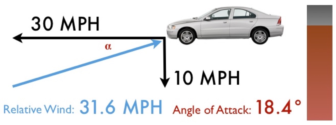
First let’s start with a concept we call relative wind. Let’s say it’s a calm day and you go for a drive in your car. As you move down the street at 30 miles per hour, you stick your hand out the window. The breeze you feel isn’t a result of the weather, it’s a result of your motion. That’s relative wind.

Level
Since this is a calm day and you’re driving on a level road, you’ll have 30 miles per hour of relative wind coming from straight ahead.
Now let’s say you drive off a cliff. Your car will still be moving forward at about 30 mph (neglecting deceleration from wind resistance). You’ll also be falling at an increasing rate. Let’s say for this snapshot in time it’s 10 mph.
Assuming your car stays nearly level, the relative wind will shift from straight ahead to somewhere in a more downward direction. As you fall faster and faster, the relative wind will get closer and closer to 90 degrees below you.

Falling
In our car-off-a-cliff example, the angle between where your car is pointing and the relative wind is called angle-of-attack. Unless your car has wings, knowing your exact angle-of-attack isn’t very useful to you as a driver.
Why does Angle-of Attack matter?
In aviation, angle-of-attack (often abbreviated as AOA or the Greek letter alpha) is the angle between the relative wind and a front-to-back line running through the middle of an airplane’s wing.
Image source: Wikipedia
Because the wing is curved, just a little bit of angle-of-attack will create lift. This good, because lift is the force that keeps airplanes airborne.
As an airplane moves faster through the air the wing creates more lift, as long as the angle-of-attack is in a certain range. In this range, the higher the AOA, the more lift you get. Past a certain point (known as the critical angle-of-attack) the higher the AOA the less lift you get. This point is known as a stall.
Image source: Wikipedia
Pure speed is not enough. It must be paired with the proper AOA or it’s useless. The good news is (if you have the altitude) getting out of a stall is easy. Drop the nose, let the AOA come down, and you’re flying again.
Air France 447 had exceeded its critical angle-of-attack and began rapidly falling out of the sky. This alone was not critical, but crew coordination errors seemed to cause the pilots to be unaware that they were the cause of the problem: commanding the nose of the airplane to remain at nearly 15 degrees above the horizon in a deep stall.
The airplane never broke its AOA, the nose never came down, and the aircraft fell over 35,000 feet until it hit the water nearly level.

40 Alpha
This may have been complicated by a lack of direct AOA indications in the Airbus cockpit. As the third interim report of the French safety investigation notes:
The value of the angle of attack is not directly displayed to the pilots.
At its highest rate of descent, the Air France A330 was dropping 11,000 feet (or over two miles) every minute – about twice as fast as an average car drives down the highway. While the airspeed alone should have been (barely) enough to keep the jet flying, with such high AOA, all that relative wind was useless.
All the aircrew had to do was lower the nose, but they didn’t realize that until it was too late.
Why didn’t the crew fix the stall?
This is the core question. It appears they tried, but by the time they understood the situation it was too late. The following paragraphs are key:
Bonin’s insistent efforts to climb soon deprived even the computers of the vital angle-of-attack information. An A330’s angle of attack is measured by a fin projecting from the fuselage. When forward speed fell to 60 knots there was insufficient airflow to make the mechanism work. The computers, which are programmed not to feed pilots misleading information, could no longer make sense of the data they were receiving and blanked out some of the instruments. Also, the stall warnings ceased. It was up to the pilots to do some old-fashioned flying.
The third interim report from the French aviation safety investigation continues:
Until the end of the flight, the angle of attack values became successively valid and invalid. Each time that at least one value became valid, the stall warning triggered, and each time that the angles of attack were invalid, the warning stopped. Several nose-up inputs caused a decrease in the pitch attitude and in the angle of attack whose values then became valid, so that a strong nose-down input led to the reactivation of the stall warning. It appears that the pilots then reacted by a nose-up input, whose consequences were an increase in the angle of attack, a decrease in measured speeds and, consequently, the cessation of the stall warning. Until the end of the flight, no valid angle of attack value was lower than 35° [emphasis added].
In this case, the system’s user did the right thing, but due to the limitations of the warning system he was punished rather than rewarded.
Due to a lack of coordinated feedback between the Airbus’s side-stick controllers other pilot at the controls had no idea this was happening.
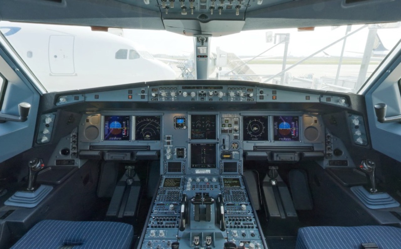
The Telegraph’s article made a big deal about the Airbus’s side-stick arrangement. As you can see, removing the yokes from the cockpit makes for a very clean layout.

A330 Cockpit
In this case the problem was not side-stick versus yoke-style controls, or even fly-by-wire versus mechanical flight controls. The problem was that the sticks weren’t linked. The captain had no idea his co-pilot was causing the problem. By the time he did it was too late.
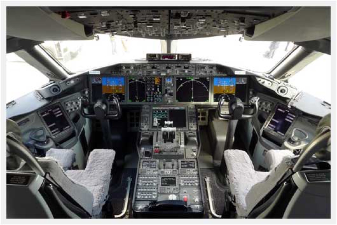
As the article notes, Boeing has taken a different approach to their cockpit UI. As you can see in this picture of the 787 cockpit, the yokes are retained.

787 Cockpit
But these differences in control layout are almost superficial in nature. More important is how they are connected.
On an Airbus, all flight controls are immobile unless a pilot moves them. This is almost exactly the way a PC joystick works.
Boeing’s cockpit designers have made sure that all the controls are linked (even on their fly-by-wire jets) so if one pilot moves the yoke, the other’s yoke moves too. If the Flight 447 captain’s side-stick had moved along with the co-pilot’s he may have understood the situation sooner.
The throttles on each aircraft also follow their manufacturers’ different philosophies:
Computers [on the Airbus A330] can automatically adjust the engine thrust to maintain whatever speed is selected by the crew. This means pilots do not need to keep fine-tuning the throttles on the cockpit’s centre console to control the power. But a curious feature of “autothrust” is that it bypasses the manual levers entirely – they simply do not move. This means pilots cannot sense the power setting by touching or glancing at the throttle levers. Instead, they have to check their computer screens. Again Boeing have adopted a different philosophy. They told the Telegraph: “We have heard again and again from airline pilots that the absence of motion with the Airbus flight deck is rather unsettling to them.” In Boeing’s system the manual handles move, even in automatic mode.
Implications for application interface design
Even if we’re designing a web application and not a fly-by-wire flight control system these lessons have value. I’m reminded first of the Rule of Least Surprise.
While haptic-feedback isn’t likely to come to HTML/CSS or Xcode anytime soon, there is also value to presenting critical information in a non-digital, analog-style format when this doesn’t otherwise sacrifice useability.
Again, The Telegraph:
A defender of Airbus puts it thus: “When you drive you don’t look at the pedals to judge your speed, you look at the speedometer. It’s the same when flying: you don’t look at the stick, you look at the instruments.”
There is a problem with that analogy. Drivers manoeuvre by looking out of the window, physically steering and sensing pressure on the pedals. The speedometer is usually the only instrument a motorist needs to monitor. An airline pilot flying in zero visibility depends upon instruments for direction, pitch, altitude, angle of climb or descent, turn, yaw and thrust; and has to keep an eye on several dozen settings and lights. Flying a big airliner manually is a demanding task, especially if warnings are blaring and anxiety is growing.
That nails it. It’s the same reason digital car speedometers were popular for a while, then vanished or were supplemented by an analog dial. Numbers, and especially the rate of change in numbers are tough to comprehend at a glance.
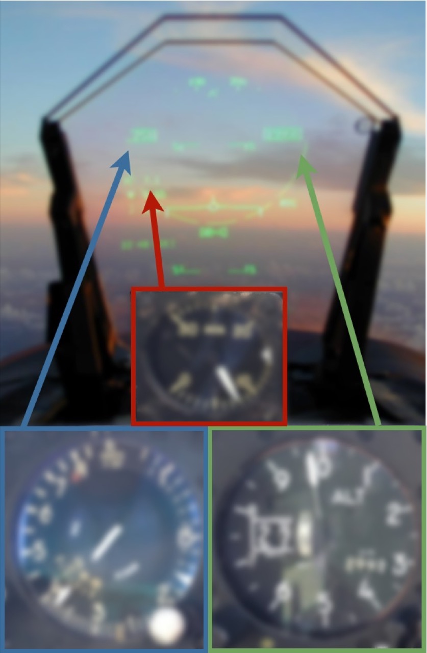
Take the series of gauges below:

Gauges
The heads up display at top is from an F/A-18E Super Hornet. The gauges at the bottom are from an F-5N Tiger II, with cockpit instrumentation about 30 years older than the Super Hornet. Altitude readouts are in green, airspeed in blue, and angle-of-attack in red.
Now let me blur them to suggest a hasty reading out of the corner of the eye, excessive vibration, or some other emergency:

Blurred Gauges
Which are still readable? If the values they showed were changing, could you tell which way the numbers are moving and how fast? Would it make any difference to know that the dials are actually blurred 50% more than the HUD?
This doesn’t mean you have to load up your interface with a bunch of dials wherever you need to display numbers. I’ve flown with both cockpits and in the vast majority of circumstances I prefer the Super Hornet by a wide margin.
What it does mean is that using complementary techniques like color changes, movement, sparklines and graphs (when appropriate) can greatly improve usability when users are faced with overwhelming and confusing data. It also means that just because it’s old and ugly, doesn’t mean it’s less usable.
There are no cut-and-dried solutions for all problems, but thinking through the ways things might fail and watching real users struggle with your software has genuine value for all interface designers.
When things are going right, the minimalistic UI of the Airbus cockpit has greatly reduced cockpit workload. In a crisis, those same design choices may have proven fatal.