Design Comparison
Yesterday, just before noon, I discovered that my company’s WordPress site had been hacked.
To be perfectly honest, our site doesn’t get a lot of traffic. It hadn’t had a content update in about a year, and it was running WordPress 3.1, so the site hadn’t had a software update in a while either. We were probably a ripe target, and deserved everything we got.
The Hack
I still don’t know the exact details, but the hack seemed to change permissions on all files under the main WordPress folders, essentially making them invisible. They were still there for an admin user, but for everyone else (and the site itself) the folders might as well have been empty.
No other damage was done and there were no effects beyond the WordPress install itself. Our theme files and the database were apparently still intact. But, since discretion is the better part of valor I went ahead and slicked the site.
We had been planning a site overhaul for a long time, and suddenly it was forced upon us. Plus, getting your WordPress site hacked and starting from scratch is popular these days.
The New Site
Seeing as we’re a web application development company, it seemed awkward to go without an official website for any length of time. Our old site had been built on WordPress, which was overkill for the amount of content we had to offer.
What we really needed was the internet equivalent of a full-page ad, with a few links to some cool things we built and maybe a client example. I also wanted to get the new site up quickly, because we’re swamped with other work right now and I needed this off my plate.
The whole site from start to finish (including new copy) ended up taking about eight hours of work and was uploaded almost exactly 24 hours after we found the hack.
Ogilvy-Compliant Design
We’re fans of mid-century design, so I turned to David Ogilvy’s classic “Ogilvy on Advertising” (affiliate link) for inspiration.
It also seemed like a neat design exercise. I was especially emboldened by the following passage:
It’s no bad thing to learn the craft of advertising by copying your elders and betters. Helmut Krone, one of the most innovative of art directors, has said: ‘I asked one of our writers recently what was more important, doing your own thing or making the ad as good as it can be. The answer was “Doing my own thing”. I disagree violently with that. I’d like to propose a new idea for our age: until you’ve got a better answer, you copy. I copied Bob Gage for 5 years, I even copied the leading between his lines of type. And Bob originally copied Paul Rand, and Rand first copied a German typographer named Tschichold.’
I, too, started by copying. Working in a London agency, I used to copy the best American ads. Later, I began to do my own thing.
Deciding to take him at his word, I dug into the chapter “Wanted: A Renaissance in Print Advertising” and followed his advice closely.
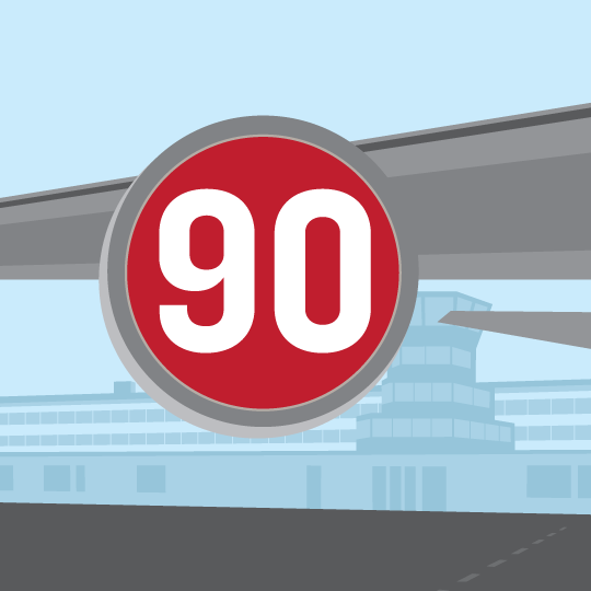
First, we started with an illustration. Ogilvy’s advertisements usually featured a distinct and dominant image at the top. He recommends photos over drawings, but it’s tough to make a detailed photo small enough for mobile bandwidth, yet detailed enough for retina displays. Vector art is more our style anyway, so we went with that instead.

high90 Jet
Bob had been playing around with a transportation theme for a while, and one of my favorite drawings of his was the wing of an airliner in front of a terminal. I grabbed his Illustrator file and made a few tweaks to emphasize our logo. For all browsers except IE8 and below, the image is an SVG, so it still looks good when scaled up for retina displays.
According to Ogilvy we needed a caption, too:
More people read the captions under illustrations than read the body copy, so never use an illustration without putting a caption under it. Your caption should include the brand name and the promise.
Since the caption cluttered up the mobile layout, you won’t see it until the browser is more than about 640px wide.
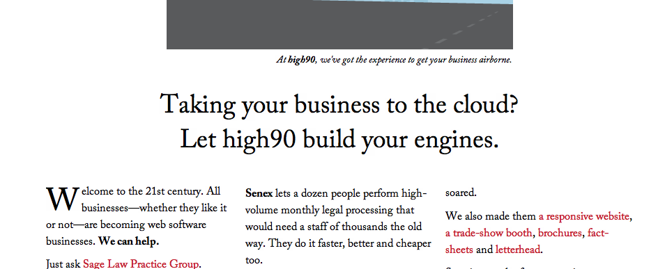
All type is set in Adobe Caslon, provided through Typekit, since “Sanserif [sic] faces … are particularly difficult to read.” The type is black on white, in keeping with his deep distaste for reverse text. The body copy begins with a drop capital, because “if you start your body copy with a drop-initial, you increase readership by an average of 13 percent.”

Title
We followed his advice and put the headline below the image, but above the copy. It has our brand name, even though it’s not the most attractive when typeset this way, since he insisted on it. We disregarded his advice and put a period at the end of the second sentence. While it does cause the reader to stop, I felt it was necessary to balance the question mark in the first sentence.
Ogilvy was a big fan of columnar text (specifically three columns) and I did my best to follow his advice. Unfortunately, responsive design means that you have to start with one and then two columns first. I used CSS3 columns (which are unsupported by IE9) but didn’t have the time to make many fixes for older browsers. They should see a single column for all viewport sizes and that’s about the best I could do.
The big challenge with columns on the web is that you don’t want to ask the reader to scroll down and then up again to follow the text flow. I solved that by breaking the text up into two sections, which kept the text blocks short and also allowed us to have a second-level header. Again violating the no-period rule, this gave us a chance for a second eye-catching tagline.

Subhead
I didn’t want a whole lot of extraneous graphics cluttering the presentation, so examples of our booth designs, brochures and letterhead are hidden away behind links and shown using the excellent fancyBox responsive JavaScript lightbox. We purchased a multisite license and it was definitely worth it.
Copy
This was a pretty big change for us. We weren’t afraid to get into longer narrative, since “long copy sells more than short”, and we also wanted a case study so our customers could see what we’ve done.
In the end, I picked our biggest client, Sage Law Practice Group. They provided a good example of how we can make a difference for a company, and we’re still very busy helping them grow.
A little extra attention for a client never hurt either.
Under the Hood
I’m afraid there’s nothing too exotic here, just plain old HTML5 and CSS3 helped along by Compass/Sass and the Takitapart Responsive Web Framework, which is now on Github and has its own Ruby gem.
We decided against a database driven site for security and laziness reasons. We had no real requirement for comments or dynamic content, and I knew we wouldn’t update the site very often. I’m not gun-shy about WordPress (I still use it all the time) but I really didn’t want to take the time to maintain our site on top of our client work. In this instance a flat site was perfectly good enough.
Results
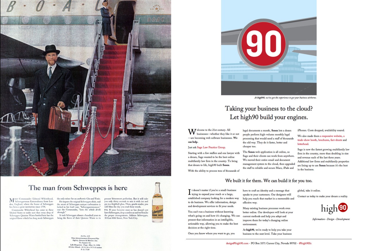
As I said, the site took me a little over a day’s worth of work and I’m pretty happy with how it turned out.

Compare
Is it derivative? I’d prefer to consider it more of an homage or a “scale model” of what a mid-century ad would look like if brought into the web age. There’s a good argument to be made that the lessons of mid-century print advertising aren’t incredibly applicable on the web, but I think you could make a case for the contrary as well. People are still people.
I’d love to hear any feedback if you’ve got it.