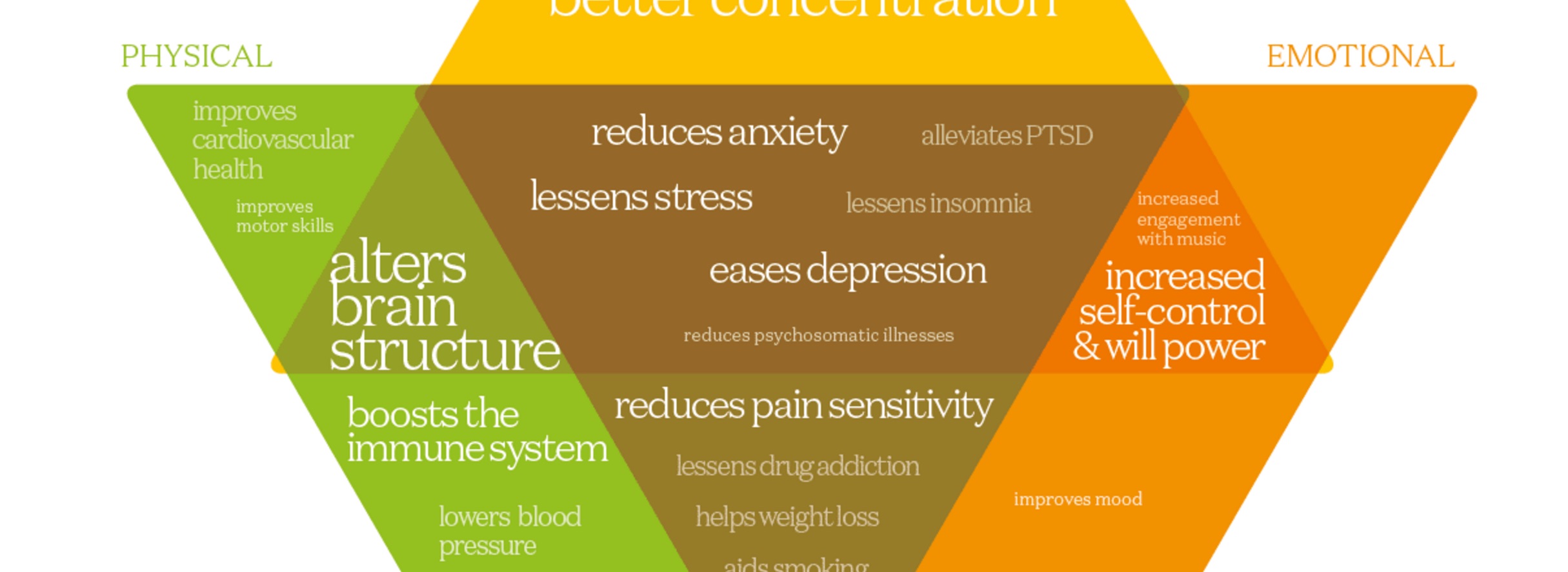
There’s a new visualization up at Information is Beautiful on the benefits of mindfulness and meditation. Aside from its utility as a guide, the graphic is also a study in how to gracefully and subtly adapt a graphical presentation for different screen sizes.
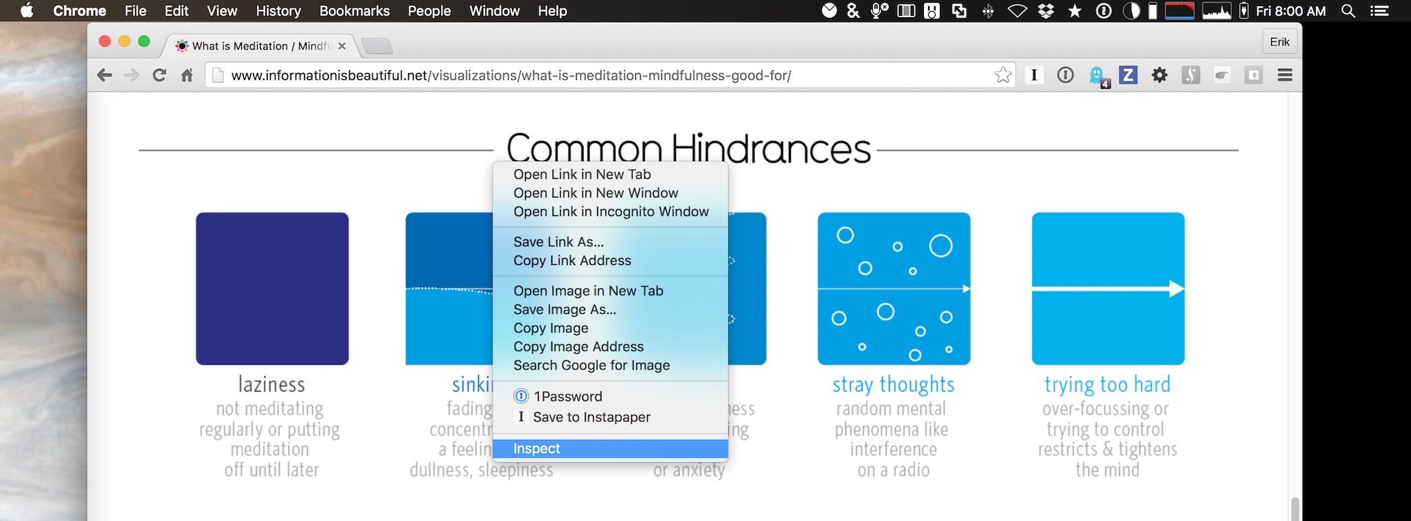
If all you have are mobile devices, browse in portrait and landscape, on phone and tablet if possible. If you’re using a desktop browser, try resizing the window. Even better, engage your desktop browser’s developer tools. On Chrome and Safari, they can be reached by right-clicking on the web page and clicking Inspect.

Opening the Web Inspector in Chrome for Mac
As you resize the browser window, you’ll see the layout change at three distinct break points: 360px, 640px and 1060px. Take a look at what’s modified at each step. Is there more or less information shown? Do the changes make some of the information easier or harder to understand at each stage? What do those changes do to the aesthetics of the page?
There are no easy answers when building responsive elements into your design. All you can do is ask the right questions and seek the best compromises.
Information is Beautiful regularly makes inspiring and interesting choices like these. Browse around their other visualizations and I think you’ll agree.
