Today Gabe and I are launching our new podcast – Technical Difficulties. I’ll let the show notes for the Welcome Back episode speak for themselves, but in this post I want to dive into a few of the details behind the site and its design.

I’ll start off with a bit about the logo. We wanted something simple and iconic that reflected how we feel about the show, podcasting, and technology in general. Gabe and I were drawn to industrial signage, and we almost immediately thought of the hand-crushingly awesome ISO Gear Entanglement Hazard label. I’m a sucker for uppercase Futura, and really liked how the thumb on the graphic interacted with the N in “Technical”. After that the icon pretty much designed itself.
Around the same time, the Getty Center announced their new commitment to open content, putting high-resolution digital versions of their art collection online for the world to use. Browsing through the paintings, I was fascinated by Claude-Joseph Vernet’s 1767 painting “A Storm on a Mediterranean Coast”.
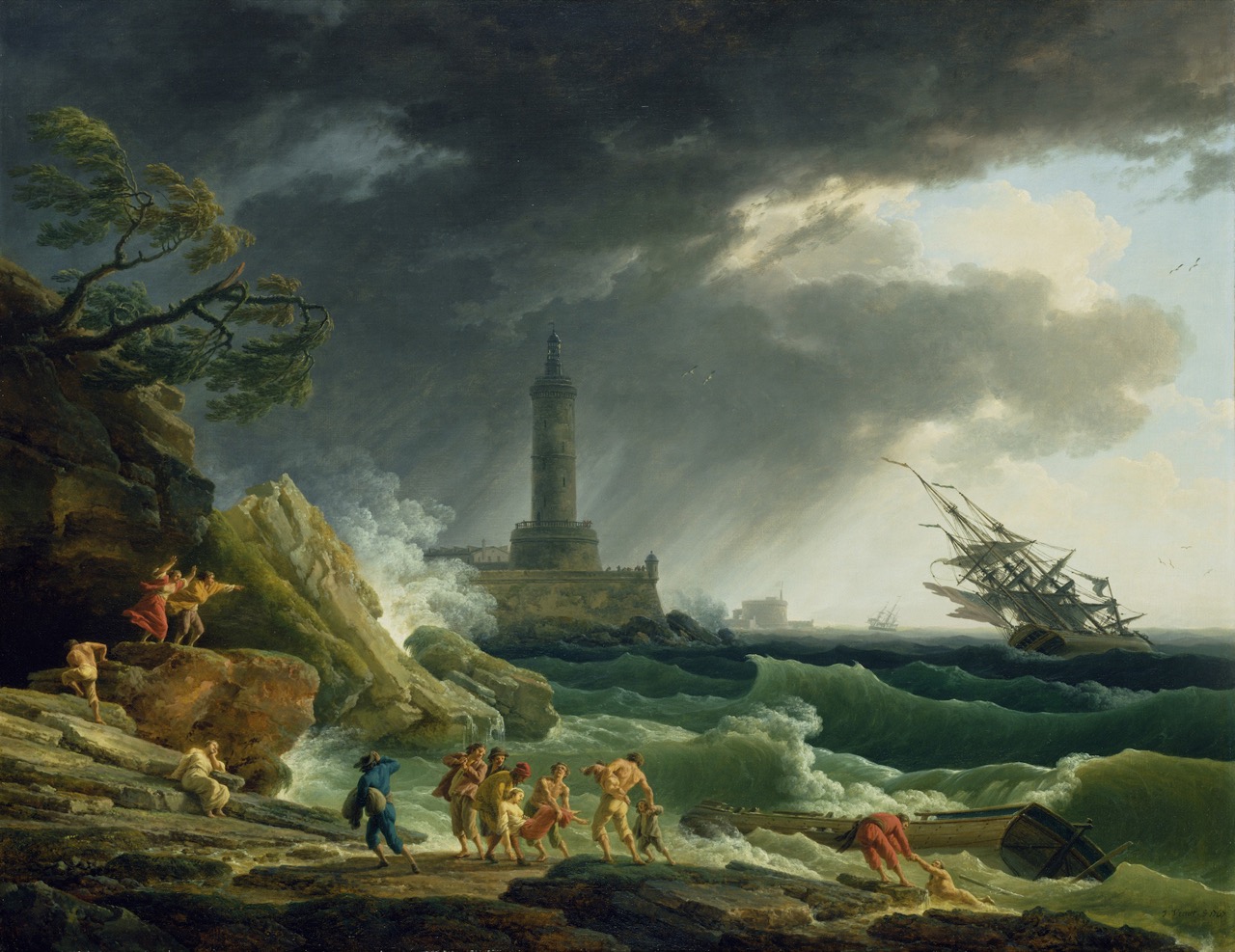
A Storm on a Mediterranean Coast
While looking at the painting in all its glorious detail, I realized that humanity has been struggling with the challenges posed by technology since we created flint tools and fire. All we can do is swim away from the shipwreck, drag ourselves out of the water, dry ourselves off, and try to build things better next time. The painting’s sentiment aligned so well with our show that it became the backdrop for our new site.
We’d used Futura for the logo, so I pretty much had to use it for the site headers. Unable to resist the urge, I paired Adobe Caslon Pro with it as the body font. You may recognize that pairing from another site I designed. It may be repetitive, but I just love those two fonts together. Hosting is provided by Typekit, a service that’s so darned useful and reasonably priced it can’t stay this good for long.
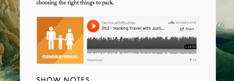
SoundCloud widget
We wanted to make it easier for listeners to jump right into the show, so we’re using SoundCloud’s playback widget. There are a lot of great things about the widget, including its responsive design, mobile friendliness (try listening on iOS, you should be able to navigate away and still keep listening), and social aspects. You can follow our stream on SoundCloud at https://soundcloud.com/techdiffpodcast where all our shows will pop up as soon as (and usually a little before) they’re released on iTunes.
In an effort to spruce up the show notes we’re also including images when appropriate. Each show has its own header, mostly sourced from the excellent Flickr Commons. If you’re looking for public domain vintage photos and they fit your theme (and for us they do) it’s a great place to look.
I’m particularly fond of the San Diego Air and Space Museum’s collection of photos and art from the now-defunct PSA. I miss the friendly smiley face on their classic 1980s paint scheme.

PSA 727
Speaking of all the neat header photos, you can browse our episode archive in two ways. If you just follow the link, it will take you to a list view. We’ve got episode search using the speedy and light list.js script, which Gabe and I both use for our site archive search. If you’re looking for something more visual, you can check out the grid view instead by toggling the icon above the episode list.
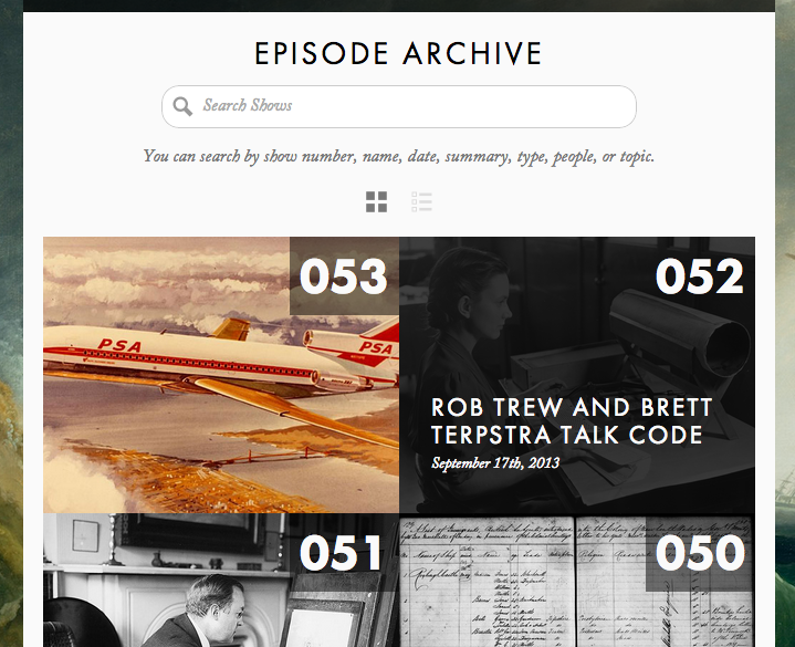
Archive Grid View
In grid view you can admire the spiffy headers, hover over each episode to get the show title and date, and search just like you could on the list view. It may not be the easiest way to find an epsiode, but it sure is a lot of fun.
As far as infrastructure is concerned, the site was built on Statamic and uses the Sass and Compass based Takitapart Web Framework (designed by Bob VanderClay, my business partner at high90) for its responsive grid-based layout.
Statamic gets better with every release, and it’s a breeze to set up a custom site for pretty much anything not requiring a lot of user interaction (like logins, comments and forums). Those features are coming soon, and then it’ll be pretty much unstoppable. Basically, if I can get away with making a site in Statamic, I do it.
What’s nice is that instead of entering all the show notes into tiny, finicky web forms, they’re all just markdown files with YAML headers that look a bit like this:
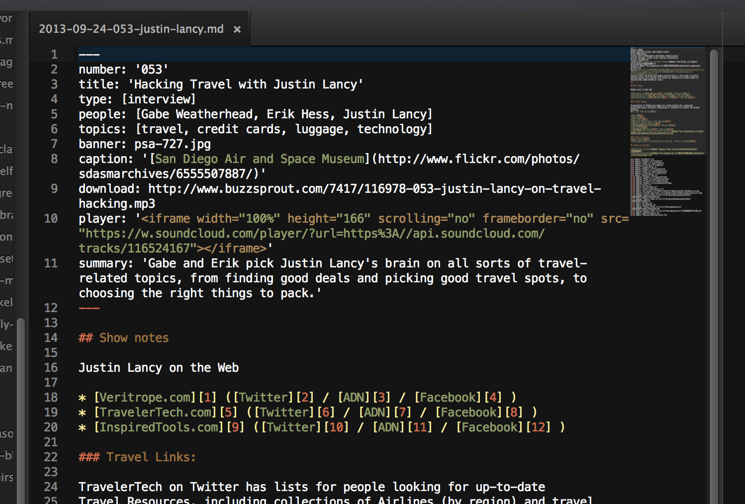
YAML!
With Statamic there’s no compiling, it just gets served up to the main page on demand. Caching on the back end makes it quick. For the non-code oriented users out there, they have a beautiful, responsive admin interface as well.
We’re thrilled to be back on the air, and I hope the site makes it a little bit easier and more enjoyable to follow the show. Thanks for reading, thanks for listening, and stay tuned for more from Gabe and I at Technical Difficulties.
