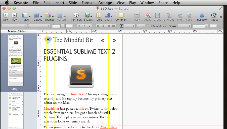
A discussion with another internet friend (aren’t they great?) reminded me of a tool I’ve found highly useful in mocking up website designs: Keynote.
Yes, Keynote the presentation tool.
Here are a few of the reasons why I like it:
- Easy to use, even for non-designers. This is extremely important in collaborative environments where your clients might be able to offer useful input.
- Helpful auto-guides and rulers.
- Supports element opacity and drop-shadows.
- Cheaper and quicker than Photoshop.
- Your design pitch slides are now 90% done.
- Easily export to images or PDF
And of course there are some caveats:
- You only get those nifty guides while editing the masters
- Your clients might be able to make changes to your designs (KIDDING!)
- If you want different sized slides for different screen widths in responsive design, you’ll have to have separate presentation files. As far as I can tell, all slides in a given presentation must use the same slide width.
- You can’t add SVG images, only PNGs and JPEGs.
There are also some real advantages to making your mockups on the slide master view. Aside from getting guides, your clients are less likely to inadvertently change your layouts while making annotations.
Just in case they might be useful to anybody, here’s a zip file with a few blank presentations set to common screen widths.
Happy designing!
