If you follow Gabe Weatherhead at Macdrifter, you might have seen his big announcement today. Gabe has developed a new site-specific search engine called NerdQuery and he was generous enough to let me help out with the design.
NerdQuery’s job is to help nerds like us find useful things by searching a high-signal/low-noise sandbox of the best nerd blogs in existence. Knowing the site’s mission and target audience, I set out to create a design that maximized speed and simplicity.
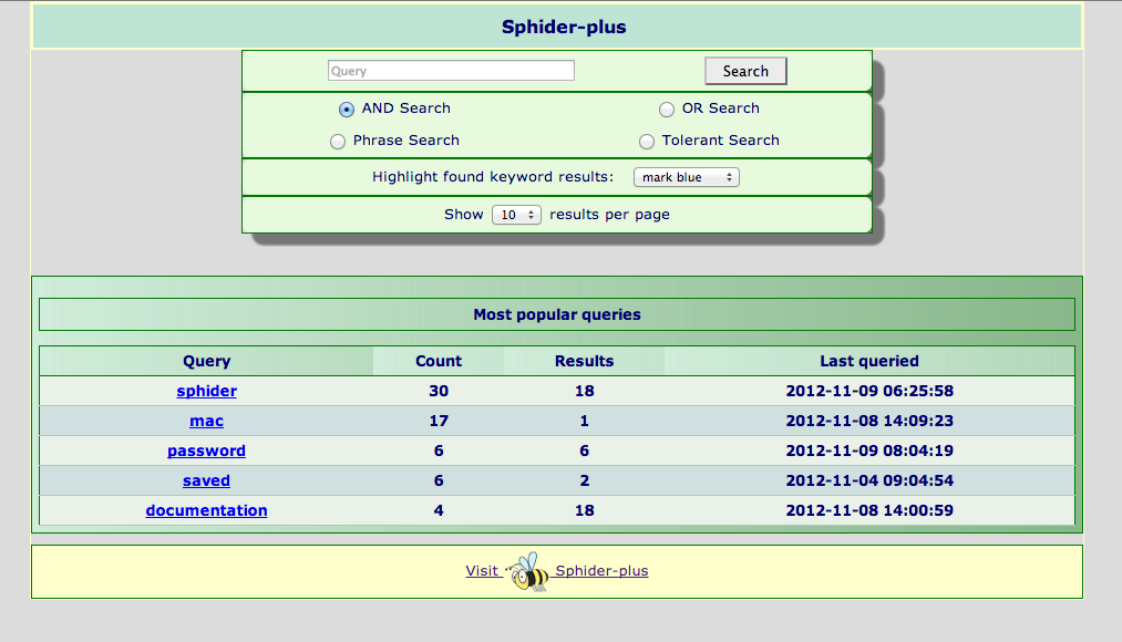
When Gabe sent me the link to his test installation, the site was using a default theme called “Pure”.
Rather than try to adapt the original theme, I decided to start with a clean-slate. What follows is a quick discussion of how the site’s colors, icons and typography evolved.
Iconography
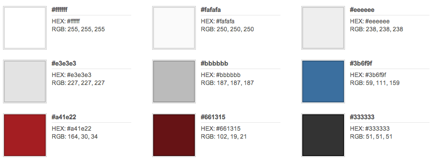
My first task was to create a memorable color scheme and icon. Once that was done, many of the site’s other design decisions would naturally emerge. I really like the muted palette Gabe uses on his website, particularly the light-gray backdrop, slate-blue metadata, and beautiful crimson-bordered header by Aaron Mahnke of Wet Frog Studios.
The design wouldn’t work if NerdQuery looked too much like the Macdrifter site, but I felt they should at least look like siblings.
With the help of a handy app named Color Schemer Studio, I created a muted palette of grays, blues and reds that would hopefully be easy on the eyes of the site’s users.
The logo itself went through a few iterations. The URL we used for the test site was
http://super.nerdquery.com
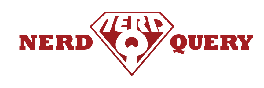
and I immediately (and incorrectly) started thinking we would call the final site Super NerdQuery. Of course the next thing out of my brain was some kind of superhero logo.
Afraid of going too far down that rabbit hole, I wanted to balance things with a font that was totally counter to typical Superman-style design. For some crazy reason Bauhaus 93 jumped out at me.

Mash those two silly ideas together and you get this:

Aside from the distortion and an extended pointed tail on the Q, it’s straight Bauhaus. Around that time I found out that “super” was just the subdomain, and that the final site’s name would be NerdQuery.
We’d probably want the full name somewhere, so I tried this:
Unbalanced, awkward and uninspiring.
The direction at the time clearly wasn’t working, so I drastically simplified things. Keeping the only element that stuck in my brain, I threw away everything but the Q—which doubled as a list-bullet and search-style magnifying glass.

Typography
If the title wasn’t going to be in the graphical header, then I knew I’d better find a good font I could extend to all the headers in the site.
Keeping the technical bent of the target audience in mind, I was drawn to monospace fonts. Typekit has a lot of options, but one that really stood out was Mono45 Headline by EuropaType.

Early on, Gabe let me know that our audience would consist of a lot of Apple nerds. I wanted an elegant sans-serif body font that would look comfortably familiar, and there was only one choice (assuming I skipped Helvetica): Myriad Pro.
I was very happy how it turned out, although I’m going to have to watch and make sure it doesn’t look too cliched over time.
It’s a Journey
Next chance I get, I’ll address layout and structure. There were some challenges with the PHP/HTML of the core template which required some deep and non-backward-compatible rework. Until that post gets written, enjoy NerdQuery and let me know if you have any comments, questions or suggestions.