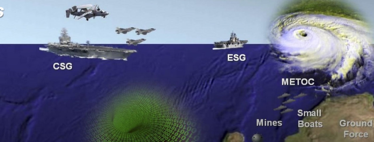
Paul Ford wrote an amusing piece the other day about the crimes-against-design which populate many military presentations. Some of the images in that piece take me right back to my good old days on AIRLANT staff.
Military presentations (and the graphics that often accompany them) have a well-deserved reputation for being awful, inscrutable, or just plain weird, especially by the appropriately high standards of Silicon Valley. There are several reasons for this, some of which are applicable to the outside world and some of which are purely a product of their environment.

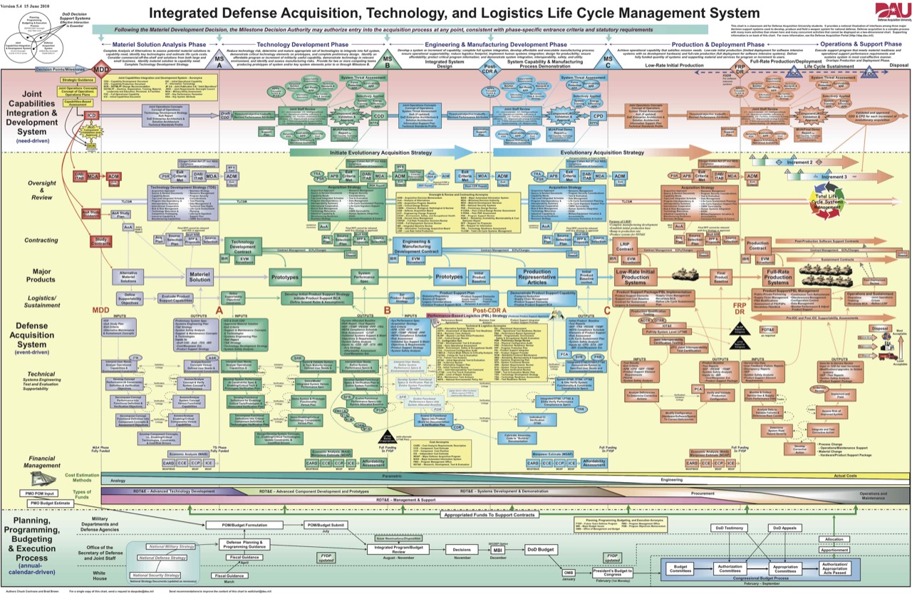
Integrated Defense Acquisition, Technology, and Logistics Life Cycle Management System – What a Mouthful
First off, there just aren’t that many design-oriented folks in government or military organizations. While I’ve had a ton of Navy friends with artistic talent – including some of the finest musicians and videographers I’ve ever met – a knack for visual design isn’t considered a highly useful skill if you’re on a path to a military career. Those who are compelled to practice it (like me, for better or worse) are often condemned to become The PowerPoint Guy.
Next, as a staff officer you’re almost always working with an awful toolset. Keep in mind that (until very recently) most Navy workstations provide the following to an aspiring presentation architect:
- Windows XP
- Office 2003
- MS Paint
Yep. That’s it. No special fonts (can’t install ‘em), no Photoshop or Illustrator (can’t install ‘em, couldn’t afford it anyway). Given those limitations, I’m impressed these presentations aren’t using more Comic Sans.

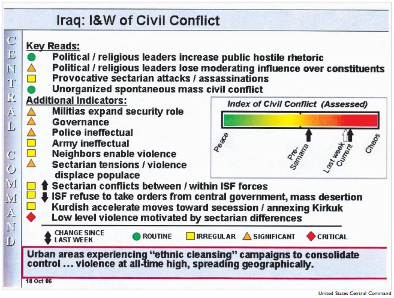
Indications and Warnings of Civil Conflict in Iraq
Another influential factor in many of these ugly presentations is a lack of time. Anyone with project management experience knows that you seemingly never have enough time to polish any timeline-based product as highly as you’d like it. I can tell you firsthand that design isn’t even on the list of a staff officer’s priorities, so the hard work required to make a clear, minimal visual point often gets put off until the end. That’s unfortunate, given the importance of many of the issues discussed in these presentations. It’s also completely understandable, given the shrinking manpower and growing demands faced by today’s military.
The time of the audience also comes into play here. The targets of these products are some of the busiest executives in the world. They want information products that cut the noise and get to the heart of complicated issues so they can make a decision and get on to the next problem. These are noble goals.

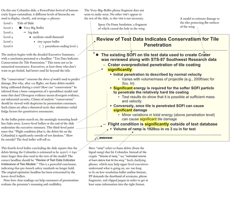
Edward Tufte’s Analysis of a Columbia Risk Assessment Slide from PowerPoint Does Rocket Science
Tragically, the military shares a misconception with the rest of the government and much of the business world that the slides should be able to act as a substitute for the speaker. While you’d think this would drive presentation designers towards clarity, it often does exactly the opposite. Diagrams with bulleted annotations can rarely provide the clarity and fidelity of well-written prose supported by a few well-chosen graphics. Yet busy executives don’t want to take the time to read a multipage essay.
Reality is messy, and that’s scary. Bullet points seem to address this by placing things in safe, easily-digestible boxes. Edward Tufte provided the classic analysis of this topic in his essays Visual and Statistical Thinking and The Cognitive Style of PowerPoint. If you’re up for purchasing some beautiful and informative books, the first essay can be found in Visual Explanations and the second in Beautiful Evidence.
Tufte primarily focuses on the slides and diagrams leading up to the Challenger and Columbia mishaps, but the lessons are broadly applicable. For a quick look at the second essay’s key points, as well as some enlightening discussion around the topic, I highly recommend the PowerPoint Does Rocket Science and PowerPoint and Military Intelligence forum threads on Tufte’s site.
The central lesson is this: The illusion of clarity offered by bulleted-lists can be misleading at best, and deadly at worst.
It’s easy to sit back on our design high-horse and laugh at the weaknesses in these presentations. The painful reality is that these are just normal people, without any design training, trying to do their jobs the best they can. They don’t have experts advising them, and even if they did, they probably wouldn’t have the time to listen.
These officers are doing about as good a job at design as most designers would do at the controls of a modern warplane. I say that not to excuse anything, but to place these very different skill sets in perspective.
I’m not exaggerating when I say that outstanding information design requires as much talent, training, and practice as executing a safe landing on an aircraft carrier at night. It can be as difficult as teasing the traces of the Higgs boson from the detectors at CERN. It can be as challenging as predicting the interaction between bipod foam and reinforced carbon carbon at Mach 2.46. It’s optimistic to expect people to excel in more than one of these fields at a time.
The temptation, of course, is to say that one of these fields is more difficult, important, or dangerous than the other. That – like the bullets on so many artless PowerPoint decks out there – would be a grave oversimplification.
